Challenge Overview
Welcome to the Agon Company Relationship Visualization D3JS Code Challenge!
Company Relationship Visualization is an innovative and interactive approach to data visualization. The data is being visualized in a series of relationship nodes that are changing depending on what “view” or “user scenario” you are currently in with the help of D3JS process map JavaScript library.
The goal of this challenge is to update the provided the prototype to implement the D3.js graph functionality as outlined below.
Challenge Requirements
You are addressing the following in this challenge.
HTML5 UI Prototype
Below, in git, you are provided with a UI prototype as code base with a sample force layout graph that implement the nodes and links of the graph, we implemented it in a previous challenge so you focus in this challenge on implementing the other functionality required.
JS Libraries
-
- You’re mainly going to write Javascript code using D3JS library in this challenge.
-
- You are free to use any open source library that helps you address the requirement.
Data Structure
The UI prototype includes a sample json file for how data structure looks like, you are expected to add more attributes to the nodes and links, or adding new objects if required.
Also you are provided in challenge forums with an Excel Sheet with sample data we used to build the sample json file :
-
Nodes sheet represents the graph nodes, it contains company attributes.
-
Parent-Child sheet represents the ownership relationship (links), first column represents the child, second column is the parent (parent owns child).
-
Finance Event sheet used to render finance events when running timeline, we don’t have these information in current json sample file so you are making modifications to add this information.
-
R&D collaboration sheet represents the collaboration relationship (links) between companies.
Graph Views
We have two graph views to support in this prototype, a “Force Directed Layout View” which is the one on a white background, it is currently the one with sample graph.
The other is “Map View” it is OUT OF SCOPE for this challenge.
Force Directed Layout Graph
-
Node :
-
- Node represents a company entity.
-
- Label of the node represents company name.
-
- Node Attributes
-
- In addition to current json attributes of a node object, each company in json must have a filler color attribute, stroke color attribute, and a size attribute. Current prototype is hardcoding these values and you need to move it to be dynamic.
-
-
- Hovering over a node will open a popup with information as in company-info.html prototype.
-
- Add configurable number of seconds to dismiss the company info popup on hover out.
-
-
- Hovering over a node will make nodes that have no parent or child association with that node to have to fade out by having a lower opacity value as shown in the design “1b Zoom close up-company.png” screenshot, while the node and its associated parent and child nodes will have 100% opacity value.
-
- Dragging graph:
-
- You can refer to this demo http://bl.ocks.org/mbostock/4062045
-
- Users should be able to drag graph.
-
-
- Sticky Node :
-
- You can refer to this demo http://bl.ocks.org/mbostock/3750558
-
- Sticky node is a node that has a fixed position and don’t move when dragging the graph.
-
- Users should be able to use shift+drag to make a node sticky.
-
- Users should be able to hold down on a node for a “configurable” number of seconds to make a node sticky.
-
- Sticky node circle style must match the design in “1d Zoom close up-sticky node.png” screenshot (see DONAR CLAXIE node).
-
- It is not in current prototype but you can see how to do it by looking at the code of the small circle number rendered on the nodes.
-
-
-
- Expand/Collapse parent node:
-
- You can refer to this demo http://bl.ocks.org/mbostock/1093130
-
- Clicking on parent node will toggle the node collapse/expand state.
-
- When collapsing a node, all nodes depends on it (child nodes) will hide, the clicked parent node will have a small circle with number on it that represents number of subnodes collapsed.
-
- Expanding/Collapsing a parent node should not expand/collapse parent nodes that are child of that node.
-
-
- In the bottom bar we have two icons
these represents collapse, and expand functionality, respectively. Clicking on them will expand/collapse all nodes to it’s parent nodes recursively.
-
-
- Grouping nodes (Force Layout Algorithm) :
-
- By default the algorithm should use the ownership relationship (links).
-
- Nodes can be grouped by selecting a characteristic in the filter popup by field.
-
- Add a new pick list section in footer to be used to select the grouping attribute. By default ownership grouping is done.
-
- The pick list will include any attribute in the JSON file.
-
- Screenshot “1f Zoom close up-group.png” show how grouping is done by Industry.
-
-
- Listview grouping :
-
- Screenshot “1g Zoom close up-sorted group.png”
-
- The list view is triggered by clicking on
icon
-
- Write a function that sort nodes by country then join the grouped nodes by collaboration.
-
-
-
- Zooming in/out
-
- The slider at bottom bar
is used to zoom the graph in/out, or by using mouse.
-
- Regrouping nodes by selected node attribute (see above) should be applied on zooming in/out, if no node attribute is selected for grouping, then it should be grouped by Industry by default.
-
- Use standard d3js zoom/pan features.
-
- Selective names
-
- screenshot : 1h Zoomed out-Selective naming.png
-
- When the view is zoomed-out it will result in a lot of nodes being showed. It's not user friendly to show all the names for all the nodes, it will become unreadable.
-
- We think we can solve this problem implementing a Clustered force layout and showing label of the nodes with the most child nodes.
-
- You can search this page for clustered force layout examples http://bl.ocks.org/mbostock
-
-
-
- Timeline
-
- The timeline function is the player UI component at the center of the bottom bar.
-
- The timeline is used to show the financing events changes between nodes between the selected start/end years.
-
- When playing the timeline, each second represents one year.
-
- The dollar sign will be displayed on the path collaboration circle. And it’s color changes based on the financing event changes.
-
- By default color is grey, this color indicates there is a financial event on that link.
-
- If financial events change occurred then color get changes to Yellow.
-
- When timeline playing is over, colors get set back to grey.
-
-
-
- Eye bird’s view (minimap)
-
- Write a function to give users a minimap view of the graph.
-
- Clicking on
icon at bottom bar will toggle the minimap popup visibility.
-
- Clicking within the minimap popup will move the nested rectangle to the clicking position.
-
- The function should be written in D3JS as it should reflect a real time view of the graph.
-
-
-
- Links
-
- We have two link types:
-
- Collaboration relationship/link
-
- This is the dashed-line circle in the middle of the line.
-
- Collaboration edges have no direction.
-
- Collaboration path have a circle in middle that represents collaboration strength (it is a link attribute).
-
- Color and thickness of the collaboration path should be pulled from JSON.
-
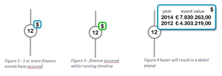
- Financing Event
-
- This is displayed on a collaboration relationship.
-
- This is using the collaboration edge circle to display the financing information represented by the dollar ($) sign.
-
- The dollar sign is displayed if we have financial events in the json between two nodes.
-
- By default the graph will render financial events of current year (i.e. 2015).
-
- If there is a financing event happening on that edge, then the dollar sign color will be grey.
-
-
- Hovering over the dollar sign will replace it with a small popup detailing the financing events happened.
-
- You can use the initial design below as a starting point, use your best judgement for how it should look and feel
-
-
-
- Ownership link
-
- This is a solid line.
-
- Ownership edges have direction (A owns B does not equal B owns A).
-
- This is the circle with percentage in the provided UI prototype.
-
- The circle stroke/border is a visual representation of the percentage in the circle.
-
- Color and thickness of the path should be pulled from JSON.
-
- All ownership information needed will taken from json.
-
-
-
Node Counts
The label 
Reset Control
The icon 
Full Screen Feature
Clicking on 
Search Feature
-
- It searches nodes by name.
-
- The matching node will be centered in the graph with opacity level 100% along with its associated parent nodes while other nodes will have low opacity (same styling as done on Hover over).
Filtering Feature
Filtering popup will use to filter the graph :
-
- User can select multiple filter conditions.
-
- User can click (x) to remove a section.
-
- Grouping should be applied when applying filtering as in “1f Zoom close up-group.png”.
-
- Country Filtering
-
- Country list should be auto complete.
-
- User can add one or more countries.
-
- Graph will be filtered to show only companies that located in the specified countries.
-
-
- Industry Filtering
-
- This section needs some changes.
-
- to/from should only accept digits, it allows filtering nodes by node code (check nodes sheet), the filtering applied in this case will find node code between to/from values.
-
- Industry input field should be drop down field with list of predefined Industries.
-
- You can assume we have Industry json with codes map, code will look up code from json and filter nodes using the code.
-
-
-
- Financial Filtering
-
- To/From field will be used to set years, but current one is set date which should be fine, you can take year from the selected date. The filter applied when selecting this one is to filter nodes that have financial events between start/end dates.
-
- Financial Type i.e. Financing round 1, financing round 2, share emission .. etc.
-
-
- Line Thickness
-
- This filters nodes by line thickness attribute.
-
- The drop down list can be populated from available values in the json or you can set configurable low/high values.
-
-
- Box Size
-
- This to filter nodes by size attribute.
-
- The drop down list can be populated from available values in the json or you can set configurable low/high values.
-
Documents
Provided in challenge forums : Design files, and excel sheet. The source code is provided in private gitlab repository (see below).
Gitlab Setup
-
- Request access to the Gitlab repo group here http://tc-ragnar.herokuapp.com/ragnar/groups/5613f730d601610e000f21bd/291490, by posting on the forums, or emailing elkhawaja at gmail.com
-
- Once added to the team, fork the repository and work off https://gitlab.com/company-owner-viz/module/tree/feature/30051706-D3JS_Graph_Part_1
Browser Compatibility
-
- IE10+
-
- Latest Google Chrome (Windows & Mac OS)
-
- Latest Safari (Windows & Mac OS)
-
- Latest Firefox (Windows & Mac OS)
Reference
-
- Examples
Final Submission Guidelines
Submission
-
A complete list of deliverables can be viewed in the UI Prototype Competitions Tutorial
-
Upload documentation for how to run your submission
-
Upload all your source code as a zip
-
Add jcori as a member of your forked repository
-
Winner will be required to submit a merge request on gitlab against the branch specified