Challenge Overview
Welcome to the "InvestLab-Portal UI Prototype-Responsive-IV Challenge". In this challenge,
we
are looking for your great development skills to quickly develop a responsive version of the existing
AngularJS application based on the given storyboard.
The purpose of the portal is to replace a manual process of sending various reports and invoices to providers via
email by providing a UI where they can view and download these reports. In accordance with regulations,
sub-distributors will be able to access the total fund universe CP has under an agreement and view 3rd party
providers' funds based on filter criteria. Also, the application goal will be to streamline the client
relationship management and the exchange of information and documentation between Admin, providers and
Sub-distributors.
Let us know any question you have!
Scope of this challenge has been reduced. The Mobile Landscape pages are out of scope.
A bonous of $200 will be paid to the winner!!
General requirements
Layout
- Layout: use the following breackpoints:
Mobile Potrait view:below 767px
Mobile Landscape view: 640px to 767px
Tablet view:768px to 1365px
Desktop (Exiting app. layout):1366px & above.
- Minimum supported width is 375px
- Focus on consistency. It's acceptable to do minor layout adjustment if storyboard isn't consistent.
Framework-specific
- Use JSON format files for the application data.
- Create services to fetch data from JSON format files.
Code Formatting
- Please use clean INDENTATION for all HTML code so future developers can follow the code.
- Provide comments on the page elements to give a clear explanation of the code usage. The goal is to help future developers understand the code.
- Use appropriate linters to validate your code.
HTML Specific
- HTML should be valid HTML5 compliant.
- All HTML code naming should not have any conflicts or errors.
- Element and Attribute names should be in lowercase and use a "-" or camel naming to separate multiple-word classes (i.e.. "main-content", or "mainContent)
- Use semantically correct tags- use H tags for headers, etc. Use strong and em tags instead of bold and italic tags.
- No inline CSS styles- all styles must be placed in an external stylesheet.
CSS Specific
- Use CSS3 Media Queries to load different styles for each page. Do not build a different page for different device/layout.
- You may use SCSS in the project.
Platform
- Desktop: IE11+, Latest Firefox, Latest Safari & Chrome Browsers (Mac & Windows).
- Primary Browser: IE11
Zeplin
- For access to the Zeplin based storyboard, apply in the challenge forum.
Application requirements
Resources & links
- Investlab-responsive to be used as the base for your submission.
- Zeplin storyboard.
- Topcoder Online Review Portal
0. General
0.1 The existing workflow in the give app should not be changed.
0.2 Reuse existing data, it's acceptable if they don't match the new responsive storyboard data.
0.3 In the header section keep using the existing logo. Do NOT use the logo from the storyboard
0.4 Keep using the existing footer icons. Do NOT use the footer icons as in the storyboard
1. Mobile
-
Login Mobile
ref: https://zpl.io/bLddvK7 and other Login Mobile section screens of the zeplin storyboard.
Follow the design to update the login page layout.
The login pages are common for all three user roles.
-
SD Mobile Portrait
ref: https://app.zeplin.io/project/5c613738c1ee7111ce95212e?seid=5cbef0e495cc881fb2d76eb8 and other SD Mobile Portrait Updates section screens of the zeplin storyboard.
Follow the storyboard to make the existing pages responsive on mobile.
Do NOT use the gradient background as in the storybard instead use existing the gray colour in the given application.
.
-
SD Mobile Portrait
ref: https://app.zeplin.io/project/5c613738c1ee7111ce95212e?seid=5cbef1678f86f74bff17aeb3 and other Provider Mobile Portrait Updates section screens of the zeplin storyboard.
Follow the storyboard to make the existing pages responsive on mobile.
Do NOT use the gradient background as in the storybard instead use existing the gray colour in the given application.
-
Admin Mobile Portrait
ref: https://app.zeplin.io/project/5c613738c1ee7111ce95212e?seid=5cac61af2bbb91be741630e8 and other Admin Mobile Portrait Updates section screens of the zeplin storyboard.
2. Mobile Landscape
Follow the mobile portrait view layout.
3. Tablet
-
Login Tablet
ref: https://app.zeplin.io/project/5c613738c1ee7111ce95212e?seid=5cbefb957600b94c1d76eccf and other Login Tablet section screens of the zeplin storyboard.
Follow the design to update the login page layout.
The login pages are common for all three user roles.
-
SD Tablet Updates
ref: https://app.zeplin.io/project/5c613738c1ee7111ce95212e?seid=5cbef11052650db6ebd8f76e and other SD Tablet Updates section screens of the zeplin storyboard.
Follow the storyboard to make the existing pages responsive on Tablet.
Do NOT use the gradient background as in the storybard instead use existing the gray colour in the given application.
.
-
Provider Tablet Updates
ref: https://app.zeplin.io/project/5c613738c1ee7111ce95212e?seid=5cbef1770d68b84bd6d22197 and other Provider Tablet Updates section screens of the zeplin storyboard.
Follow the storyboard to make the existing pages responsive on Tablet.
Do NOT use the gradient background as in the storybard instead use existing the gray colour in the given application.
-
Admin Tablet Updates
ref: https://app.zeplin.io/project/5c613738c1ee7111ce95212e?seid=5cbeefeb4cb082b6f7996f69 and other Admin Tablet Updates section screens of the zeplin storyboard.
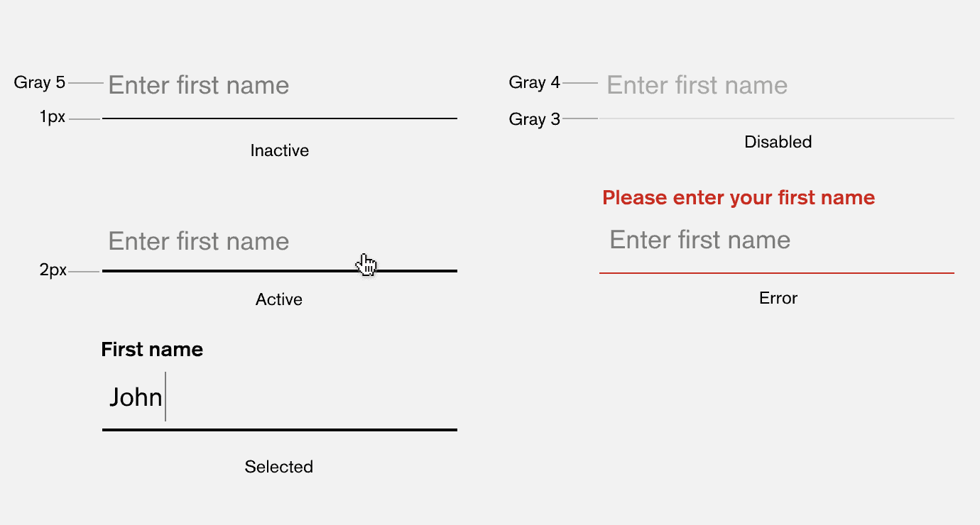
4. Reposition the placeholder/hint text above the textbox
- ref:
Update the style of all textboxes such that on focusing a textbox the hint should reposition above the text area to become the label. The text changes from "Enter 'label cpation'" to 'label caption'.
Final Submission Guidelines
- Include a README.md in your submission based on this template. This should list all the steps necessary to configure and run the submitted application.
- Submit all the files in a single zip container.
Licenses & attribution
- Third-party assets used to build your item must be properly licensed or free for commercial use. MIT, some modified BSD, Apache 2 licenses are ok. If a library is not commercial friendly you will need to get our approval first.
- Sufficient information regarding third-party assets must be present in your documentation. This includes the author, license info and a direct link to the asset online.
Win challenge, earn TCO points along with the challnge prize & travel to any of these topcoder open 2019 regionals* in Japan, China, India or South America or even finals in the USA.
FAQs
After submission as a submitter what should be my next step?
Once the challenge submission phase is over the assigned reviewers are going to review all the submissions based on the challenge scorecard. They are expected to raise all issues found in the submissions they are reviewing. After the completion of review phase the Appeal phase statss. In this phase, the submitters should go to the Online Review page, select the project & have a look at the issues raised by the reviewers. If you disagree with the reviewer on any issue/comment, raise an appeal by clicking the 'Appeal' button associated with the section and entering the appeal comment.
When & where I can see the challenge results?
After the Appeal response phase is over the results are displayed on the challenge specification page as well as on the online reivew page.