Challenge Overview
Challenge Objectives
-
Build the prototype in angular 8 from given .sketch design file.
Project Overview
The application we are trying to build is a CRM for Wellmark to show benefits of insured plan of a patient, which is a member of Wellmark, for given period of date range. It is a single screen app with 6 tabs with around 8 sections.
Browser Support
-
Latest chrome, IE, firefox & safari
-
Should be mobile responsive(though we don’t have design, please use your best judgement, basically it should be usable on phone)
Assets:
-
Sketch file is shared on forum
-
Component library is shared on forum which is output of https://www.topcoder.com/challenges/30108341
-
Fonts
Individual Requirement
Benefits Page
I am breaking the page as section wise to explain easily. Let's discuss on forum if anything is not clear or there is improvement available. These breakdown is for medical tab, other tab has similar section
-
Header bar

Left side shows “Benefits - <patient name>”
Right tabs switch between available plans for the member(patient) and will be colored to show if the member is not enrolled in that plan for the date specified.
If we select Medical only then it should only show the data related to the medical plan in below sections, similarly if dental plan is selected we will show the dental-related data only and so on.
-
Left navigation
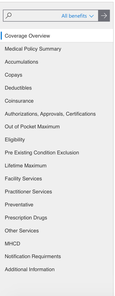
Search box allows to search all sections of the page. The dropdown in right area shows following options:
-
All benefits/Medical/Dental/Pharmacy/Wellness
So based on this selected section the entered text will be used to search the content of page in that particular section.
The other list is Sticky navigation that follows the user scroll and on click takes them to that section of the benefits page.Context sensitive for each tab.
-
Patient information

This information is related to patients.
-
Coverage section
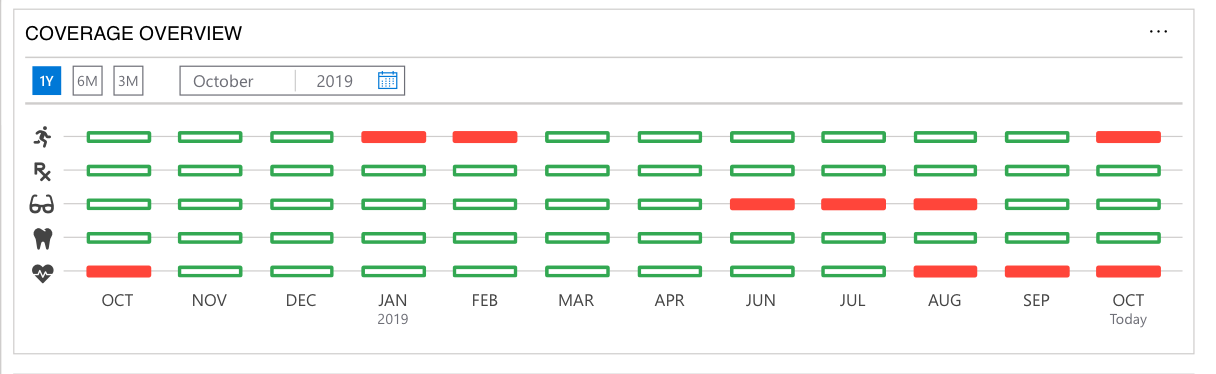
This section shows whether or not the user had coverage for that month for particular plan.
-
Bordered Green is coverage for the full month
-
Bordered Red box is partial coverage for that month,
-
Solid red box means no coverage for that month
This section will be shown on all tabs.
Datepicker icon should open the datepicker,
Datepicker should be based on https://www.google.com/url?q=https://developer.microsoft.com/en-us/fabric%23/controls/web/datepicker&sa=D&ust=1575075333661000&usg=AFQjCNHelxA86bg5zzEVzAmnXEHCxp96bA
using the link above, the "default" date picker looks and feels much as we prefer, and allowing the flexibility to select a specific day, month, and year
-
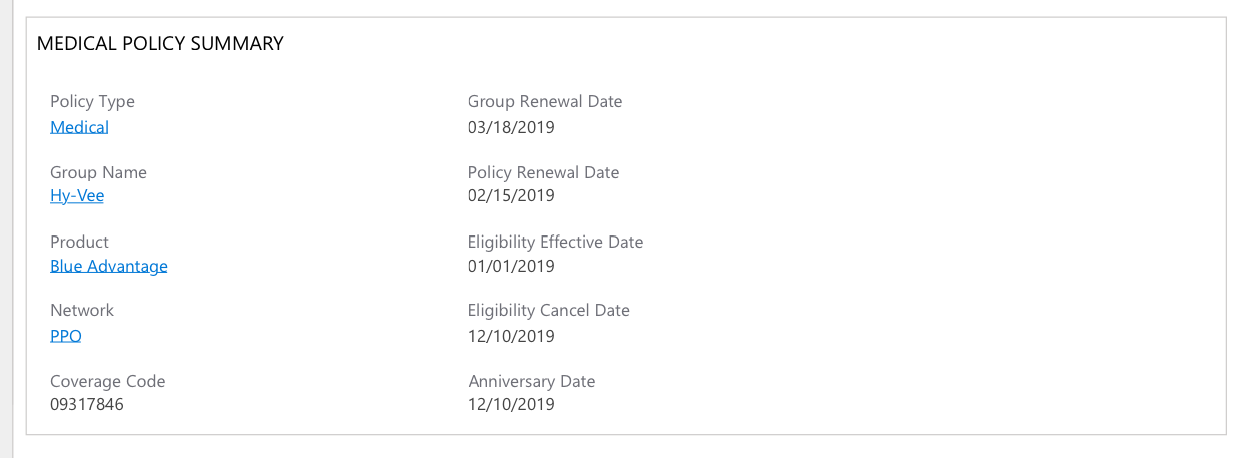
Medical Policy Summary
-
The content and layout of information is different for different tab, see the wireframe for other tabs.
-
Accumulation $ amount

-
The question mark icon gives the user information about the functionality of the add to notes icon.
-
The icon on the rows allows the user to add this line from the table to their notes. It is blue outline if not added and green solid when added to notes, the text also changes to green for the row when added to notes
NOTE: the "notes" functionality is much like "copy and paste". When viewing line items on a table or other data elements on the page and the user would like to refer to specific information at a later time. The user clicks the "note" icon which will take the information on that row/section and copy/paste it to a running list of previously selected "note" fields in a document TBD
-
Clicking on any link in any of the accumulation table will show you a pop up with all of the claims that processed toward that accumulation
-
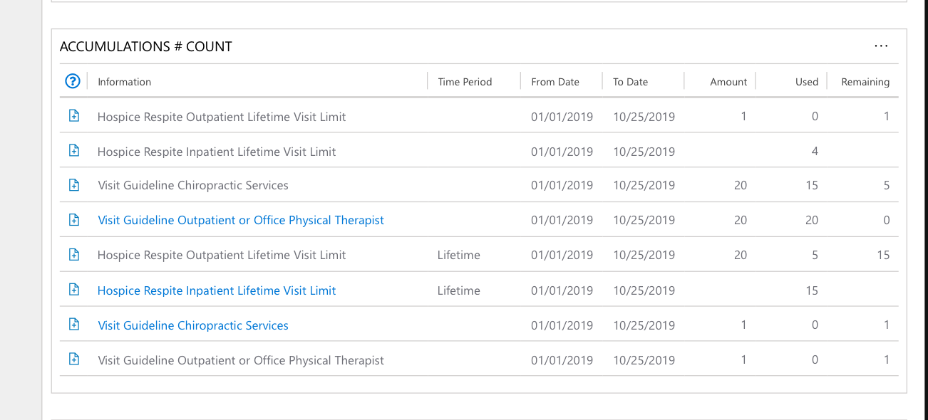
Accumulation # count
-
What are some blue colored items means?
-
They are hyperlink
-
-
Will the add to notes feature will be similar to Accumulation $ amount table?
-
Yes
-
-
Copays

-
Note feature will be similar to above section
-
Coinsurance

-
Note feature will be similar to above section
-
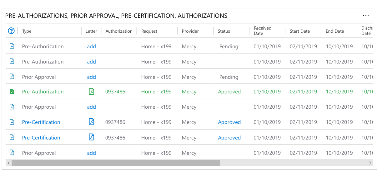
Authorizations
-
Will the notes feature will be similar?
-
Yes
-
-
Letter column allows you to upload files. Once the file is attached it should show the pdf icon with a link to the file.
-
What is blue colored item means?
-
link(can be dead link for now)
-
-
Approved link will expand the table row to show the line item as seen in below wireframe

-
Benefits Summary

-
The search box only searches the OBS content below it.
-
Expand All link will toggle the accordions below
-
The benefits information from OBS will be presented write in first, then non standard, then the standard benefit.
-
The OBS information is in accordions based on each section header from OBS. These accordions are collapsed by default and clicking them will allow the user to expand them.
Note: Above description is for only Medical tab, you need to follow this design and check the wireframe for other tabs.
Non Functional Requirements:
-
All code must pass angular lint(ng lint)
-
Provided library component should be used as much as possible.
-
Components should be broken down on meaningful way
-
All data here must come from a json files or mock server. No hardcoded is accepted.
-
Follow angular best practices.
Final Submission Guidelines
Please submit the following:
-
An angular 8 project with deployment guide