January 12, 2021
Draw Different Two-Dimensional Graphs with Matplotlib in Python

Matplotlib is a Python-based plotting library similar to Matlab. It provides a similar set of command APIs, which is very suitable for interactive drawing. We can easily use it as a drawing control and embed it in a GUI application. It contains a large number of tools that can be used to create a variety of graphics, including simple linear graphs, scatter plots, sinusoids, and even three-dimensional graphs.
Numpy is a Python library for mathematical operations. It was installed when matplotlib was installed. Pyplot is a submodule of matplotlib, which mainly provides a state machine interface for the underlying object-oriented drawing library. The state machine implicitly automatically creates numbers and coordinate axes to achieve the required drawing. Everything in matplotlib is organized according to hierarchical results. The top layer is the matplotlib “state machine environment” provided by pyplot. Based on this state machine environment, we can create graphics.
This article introduces the use of matplotlib to draw different two-dimensional graphics.
Basic drawing process:
-Create the canvas
-Add title, add X axis and Y axis name, modify the scale and range of X axis and Y axis
-Draw graphics and adjust the graphic style
-Add legend
-Display picture after drawing
-Save Picture
When using any third-party library in Python, you must first import.
1 2import matplotlib.pyplot as plt import numpy as np
The basic usage of matplotlib will not be introduced in detail. The following introduces several two-dimensional graphs often drawn with matplotlib.
Line graph
Draw multiple graphics in one drawing.
The code is:
1
2
3
4
5
6
7
8
9
10
11
12
13
import matplotlib.pyplot as plt
import numpy as np
fig = plt.figure()
x = np.linspace(0, 2 * np.pi, 50)
y_sin = np.sin(x)
y_cos = np.cos(x)
plt.title('sin(x) & cos(x)')
plt.xlabel('X axis')
plt.ylabel('Y axis')
plt.plot(x, y_sin, color = "red", linewidth = 1.5, linestyle = "-.", label = "y_sin")
plt.plot(x, y_cos, marker = '+', linestyle = '-', label = 'y_cos')
plt.legend(loc = "upper left")
plt.show()
The output is:
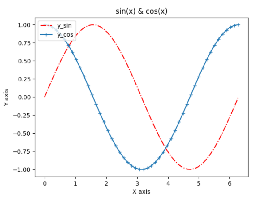
Multiple submaps in one drawing
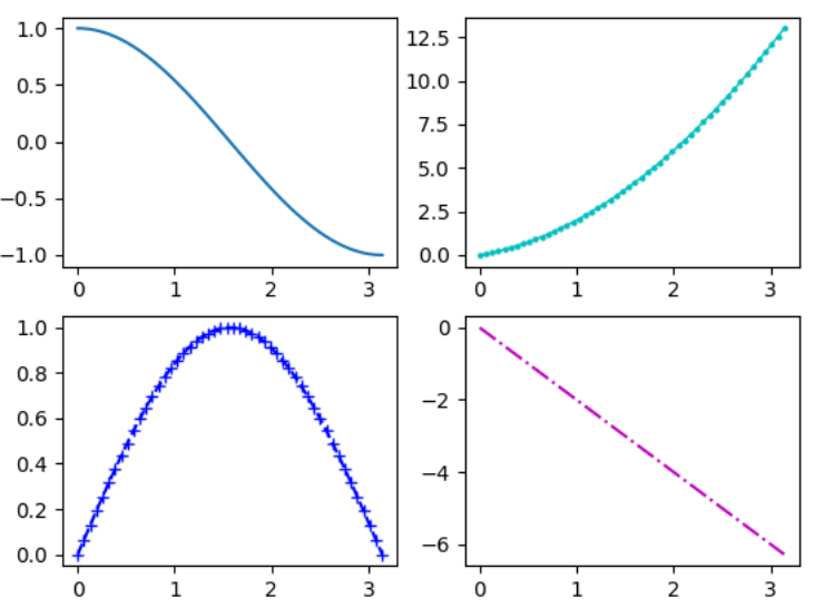
If you do not declare the artboard in advance, the default is to create one artboard and one drawing paper. So, how do you use Python to draw multiple sub-pictures on one artboard?
• Use the figure() method to create a drawing board 1
• Use the subplot() method to create a drawing paper, and select the current drawing paper and draw, parameter 1 number of rows, parameter 2 number of columns, parameter 3 selects the drawing paper, such as: ax1 = fig.add_subplot(221)
• Also use the subplot() method to select the drawing paper and draw
• Finally display graphics
1 2 3 4 5 6 7 8 9 10 11 12 13 14 15 16 17import matplotlib.pyplot as plt import numpy as np fig = plt.figure() ax1 = fig.add_subplot(221) ax2 = fig.add_subplot(222) ax3 = fig.add_subplot(223) ax4 = fig.add_subplot(224) x = np.linspace(0, np.pi) y2 = -x * 2 y_sin = np.sin(x) y_cos = np.cos(x) z = x ** 2 + x ax1.plot(x, y_cos) ax2.plot(x, z, 'co-', linewidth = 1, markersize = 2) ax3.plot(x, y_sin, color = 'blue', marker = '+', linestyle = 'dashed') ax4.plot(x, y2, 'm-.', markersize = 2) plt.show()
The output is:
Scatter plot
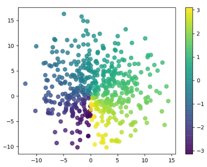
First, the points x and y of the data to be drawn are generated, then an array size of control size is generated for each data point, and then an array color of control color is generated for each data point. Finally, a color bar is added through colorbar().
1
2
3
4
5
6
7
8
9
import matplotlib.pyplot as plt
import numpy as np
fig = plt.figure()
x = np.random.normal(1, 5, 500)
y = np.random.normal(1, 5, 500)
colour = np.arctan2(x, y)
plt.scatter(x, y, s = 50, c = colour, alpha = 0.8)
plt.colorbar()
plt.show()
The output is:
Histogram
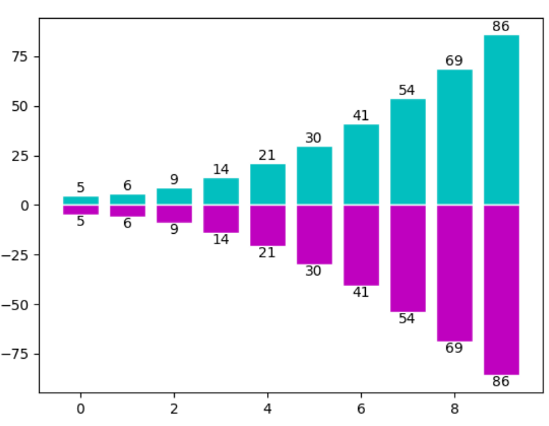
We often use histograms. Let’s draw a histogram and mark the value corresponding to the data on the graph. After generating the data x and y, call the plt.bar function to draw a histogram, and then mark the value with plt.text, set the parameter ha=‘center’ to align horizontally to the center, and set va=‘bottom’ to align vertically to the bottom (top).
1
2
3
4
5
6
7
8
9
10
11
import matplotlib.pyplot as plt
import numpy as np
x = np.arange(10)
y = x ** 2 + 5
plt.bar(x, y, facecolor = 'c', edgecolor = 'w')
plt.bar(x, -y, facecolor = 'm', edgecolor = 'w')
for i, j in zip(x, y):
  plt.text(i, j, "{f}".format(f = j), ha = "center", va = 'bottom')
for i, j in zip(x, y):
  plt.text(i, -j, "{f}".format(f = j), ha = "center", va = 'top')
plt.show()
The output is:
Pie chart
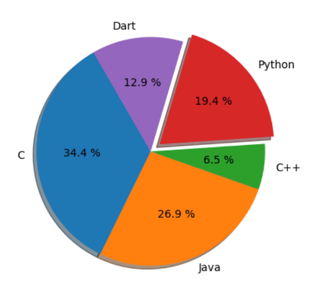
The pie chart is drawn by directly calling the pie method of plt.
explode: the percentage of a block protruding from the center, 0 means not protruding, and 0.1 means protruding 0.1 from the center.
startangle: can rotate the figure counterclockwise;
autopct='%1.1f%%': display the percentage of each block, with one decimal place;
shadow: when it is true, a “three-dimensional effect” can be created at the edges of certain blocks;
wedgeprops={'edgecolor':'black'} is to set the color of the decomposition line between blocks.
1
2
3
4
5
6
7
import matplotlib.pyplot as plt
slices = [32, 25, 6, 18, 12]
labels = 'C', 'Java', 'C++', 'Python', 'Dart'
plt.axes(aspect = 1)
explode = [0, 0, 0, 0.1, 0]
plt.pie(x = slices, labels = labels, autopct = '%1.1f %%', shadow = True, startangle = 120, explode = explode)
plt.show()
The output is:
The above introduces several commonly used two-dimensional graphics drawn with matplotlib, and we will introduce matplotlib to draw three-dimensional graphics in another article.