July 10, 2023
Information Architecture vs UX Design: What's the Difference?

In the world of digital design, two pillars stand tall, shaping our interactions with websites, apps, and digital products: Information Architecture (IA) and User Experience Design (UX Design). Like two skilled architects, they work diligently to create seamless and captivating digital landscapes. In this piece, we’ll find out what sets them apart and how they complement each other.
Information Architecture In A Nutshell
Information Architecture, the mastermind behind seamless digital journeys, is all about organizing information in a captivating, logical, and user-friendly way. It’s the secret sauce that ensures users find what they’re looking for and understand it effortlessly.
The Key Elements Of Information Architecture
These elements are the secret that enables IA to transform design chaos into clarity and make the digital world a user’s playground. They include the following;
1. Organization and Structure: IA focuses on arranging information logically and coherently. It involves determining hierarchies, categorizing content, and establishing relationships between different pieces of information.
2. Navigation Systems: IA designs intuitive navigation systems that help users easily move through the digital product. This includes creating menus, navigation bars, search functionalities, and other elements that aid in exploration and discovery.
3. Taxonomy and Labelling: IA employs effective labeling and categorization systems to make information findable and understandable. This involves creating consistent and meaningful labels, defining categories, and developing taxonomies that reflect user mental models.
4. Search Functionality: IA considers the implementation of robust search features to enable users to quickly locate specific information within a digital product. This includes designing search interfaces, integrating search algorithms, and optimizing search results.
5. Content Hierarchy: IA establishes a clear hierarchy of content, ensuring that important information receives prominence while maintaining a logical flow of information. This hierarchy helps users prioritize their attention and understand the relative importance of different elements.
The Key Processes And Methods In Information Architecture
By following the IA processes and methods listed below, information architects can create a well-structured and user-centered information architecture that enhances usability, and overall user experience within a digital product.
1. Research: IA begins with thorough research. This involves understanding user needs, business goals, and studying existing content. User research methods like interviews, surveys, and observation help gain insights into user behaviors, preferences, and mental models. Competitor analysis helps identify best practices and learn from existing solutions.
2. Information Organisation: Once the research phase is complete, IA professionals delve into organizing the information. They create content hierarchies by determining the relationships and priorities between different content elements. This involves categorizing information, establishing logical structures, and defining taxonomies. The goal is to ensure that users can easily navigate and comprehend the content.
3. Wireframing and Prototyping: IA practitioners employ wireframes and prototypes to visually represent the information architecture. Wireframes are skeletal layouts that depict the structure and placement of content elements. Prototypes are interactive representations that allow users to navigate and interact with the proposed IA. These visual representations help validate the effectiveness of the IA design, identify potential issues, and iterate on the structure as needed.
4. Card Sorting: Card sorting is a technique used in IA to involve users in the process of organizing information. It involves providing users with physical or virtual cards representing different content elements and asking them to group and categorize them based on their understanding. This exercise helps IA professionals understand users’ mental models, preferences, and expectations, guiding the creation of an IA that aligns with user needs.
5. User Flows: User flows visually map out the paths and steps that users take to accomplish specific tasks within a digital product. They illustrate the sequence of interactions and decisions a user makes, helping IA professionals identify potential bottlenecks or gaps in the user journey. User flows enable them to optimize the IA by streamlining the navigation and ensuring a seamless user experience.
Image is taken from Unsplash.com
6. Site Maps: Site maps are visual representations of the overall structure and hierarchy of a website or app. They provide an overview of the content organization, showcasing the relationships between different pages or sections. Sitemaps aid in understanding the scope of the IA, identifying content gaps or redundancies, and facilitating collaboration between IA professionals and other stakeholders.
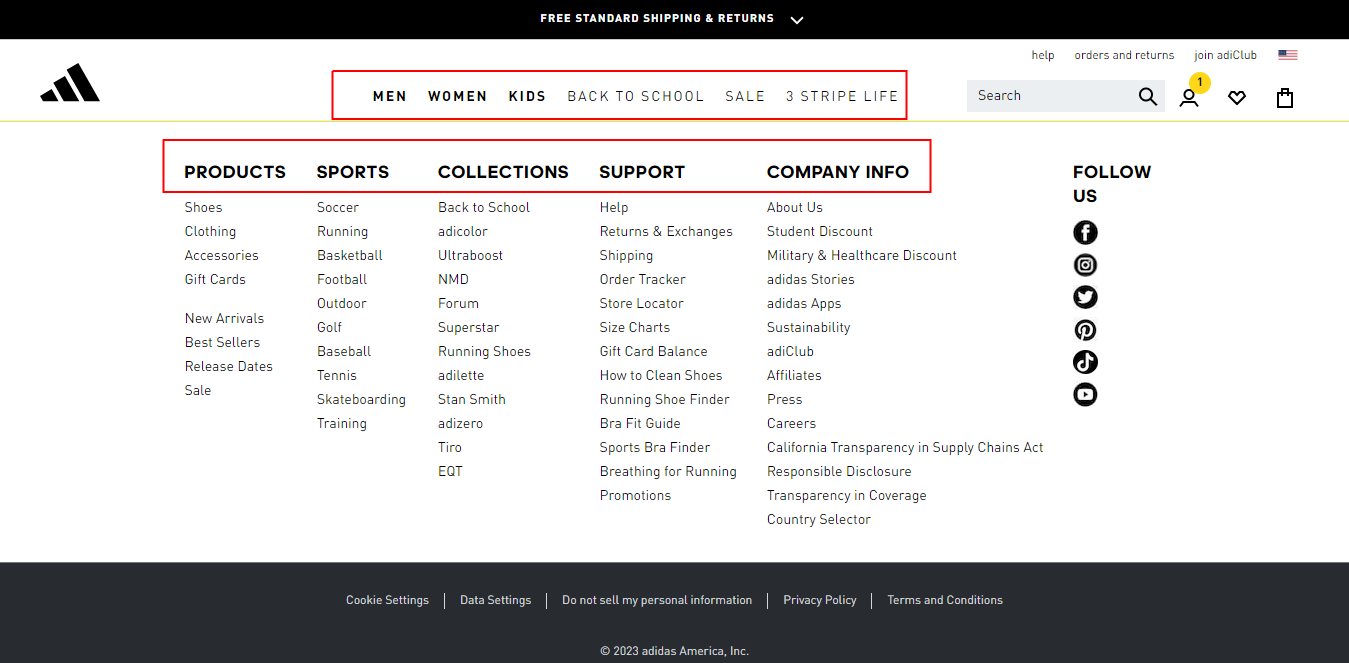
To put IA in perspective, let’s take a look at how Adidas has made shopping easy on its website.
Clever navigation structure - As large as its catalog, the homepage is divided into several sections, each of which contains information about a different product category or topic. We can see that users will not experience a hard time finding the products of choice.

Adidas’ homepage navigation
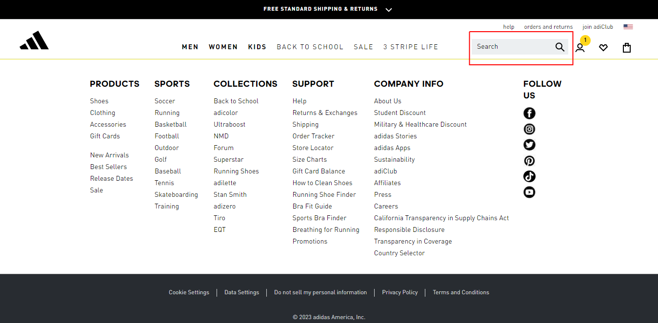
.Search bar - The Adidas website also has a search bar that allows users to search for specific products or information. The search bar is located in the top right corner of the website, and it is easy to find and use.

The search bar on the Adidas homepage
The Adidas search bar also comes loaded with popup suggestions per category. It makes it easy to find products as it filters the search result according to input.
Adidas advanced search
What Tools Do Information Architects Use?
Information Architects (IAs) use various tools to support their work and streamline the process of designing and implementing effective information architectures. Some of the commonly used tools by IAs are;
1. Diagramming and Wireframing Tools: Tools such as Adobe XD, Sketch, Axure RP, FigJam, and Balsamiq allow IAs to create wireframes and visual representations of the information architecture. They help in organizing content, designing navigation systems, and showcasing the structure and layout of digital products.
2. Prototyping Tools: Prototyping tools like InVision, Figma, Proto.io, Adobe XD, and Marvel enable IAs to create interactive prototypes that simulate user interactions and flows. These prototypes help test and validate the information architecture, gather user feedback, and refine the design.
3. Card Sorting Tools: Online card sorting tools like OptimalSort, Treejack, and UserZoom facilitate remote and online card sorting exercises. These tools enable IAs to collaborate with users, collect data on how users categorize and group information, and gain insights into user mental models.
4. Collaborative Design and Documentation Tools: Tools like Miro, Mural, and Google Workspace (formerly G Suite) provide collaborative spaces for IAs to work with cross-functional teams. These tools allow for real-time collaboration, brainstorming, and documentation of the information architecture process.
5. Diagramming and Visualization Tools: Tools like Microsoft Visio, Lucidchart, and draw.io assist IAs in creating flowcharts, site maps, and visual representations of the information architecture. These tools help in communicating and presenting the IA design to stakeholders and development teams.
Understanding UX Design
UX Design is the art of understanding users’ desires, dreams, and frustrations and translating them into unforgettable digital encounters. Its purpose? To create digital masterpieces that leave users in awe.
The Key Elements of UX Design
These are often referred to as the Five Planes of UX. They work together harmoniously to create a remarkable user experience. They include;
1. Strategy: The strategy sets the course for our journey, guiding us toward creating an exceptional user experience. It involves understanding business goals, and target audience, and defining the overall vision for the product. The strategy lays the foundation for our design decisions, ensuring that we’re headed in the right direction.
2. Scope: Think of scope as setting the boundaries for our design expedition. It helps us determine what features and functionalities will be included in the product. We carefully consider the needs and expectations of our users, balancing them with practical constraints like time, resources, and technical limitations. Defining the scope ensures that we focus on creating a valuable and achievable user experience.
3. Structure: This is the sturdy backbone of our design. It’s about organizing and arranging information in a logical and user-friendly manner. We create a clear and intuitive navigation system, making it a breeze for users to explore and find what they need. By structuring the content and interactions, we ensure that users can easily navigate through the product, saving them from any frustrating detours.
4. Skeleton: This serves as the essential framework of our design, setting the stage for the key elements and interactions. Within this foundation, we determine the arrangement and positioning of buttons and menus, as well as establish the flow of interactions. This framework allows us to visualize the overall structure of the product and anticipate how users will engage with it.
5. Surface: This is where we add delightful visual touches to our design. We apply color, typography, imagery, and other visual elements to create an engaging and visually pleasing experience. The surface gives our design its personality, reflecting the brand identity and evoking emotions in our users.
UX Design Processes And Methods
These are integral to creating successful and user-centered digital experiences. Let’s explore some of the key UX Design processes and methods.
1. Research and Analysis: UX Design begins with thorough research and discovery to gain insights into user needs, behaviors, and preferences. This involves conducting user interviews, surveys, and usability testing, as well as analyzing market trends and competitor analysis. The goal is to understand the target audience and their goals to inform the design process.
2. User Persona Development: User personas serve as fictional representations of various user types derived from thorough research. UX designers employ personas to add a human touch to the target audience and gain insights into their motivations, needs, and challenges. These personas play a pivotal role in steering design choices, ensuring that the product is customized to cater to specific user groups.
3. User Journey Mapping: User journey mapping involves visualizing the end-to-end experience of users as they interact with a product or service. It identifies touchpoints, emotions, and pain points throughout the user’s journey. User journey maps provide a holistic view of the user’s experience, helping UX designers identify opportunities for improvement and create seamless interactions.
4. Information Architecture: Information Architecture (IA) is a critical component of UX Design. It involves organizing and structuring the content and information within a product logically and intuitively. IA ensures that users can easily navigate and find the information they need, enhancing the overall user experience. A part of the deliverables for IA is wireframes and prototypes.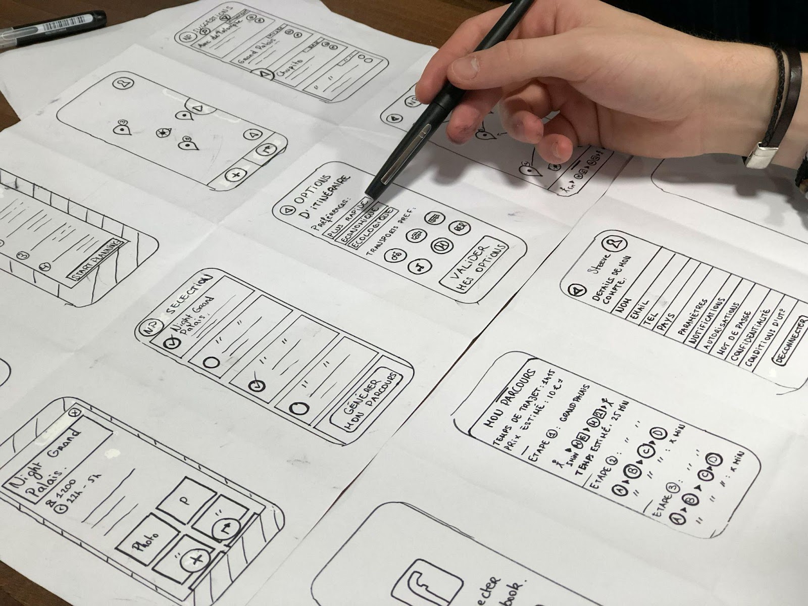
Image is taken from Unsplash.com
Wireframing is the process of creating low-fidelity visual representations of the user interface. It focuses on the layout and structure of the design without getting into visual details. Prototyping, on the other hand, involves creating interactive and more high-fidelity representations of the design. Wireframes and prototypes allow designers to test and iterate on the design before development, ensuring usability and user satisfaction.
5. Usability Testing: Usability testing involves observing and gathering feedback from users as they interact with a prototype or a live product. This method helps identify usability issues, pain points, and areas for improvement. UX designers conduct usability tests to validate design decisions, make data-driven improvements, and enhance the user experience.
6. Iterative Design: UX Design follows an iterative approach, constantly refining and enhancing the design based on user feedback and data. This ongoing improvement process ensures that the design evolves and aligns with user expectations.
Let’s take a look at some of Apple’s website features that make it a great UX site.
1. The use of white space - Whitespace is the space between elements on a webpage. It is often used to create a sense of space and organization. On Apple’s website, whitespace is used effectively to make the website easy to scan and to focus attention on the most important content. This reduces distraction for users, hence a good UX.
While this feature almost goes unnoticed, it goes a long way in creating a positive, long-lasting impression for users.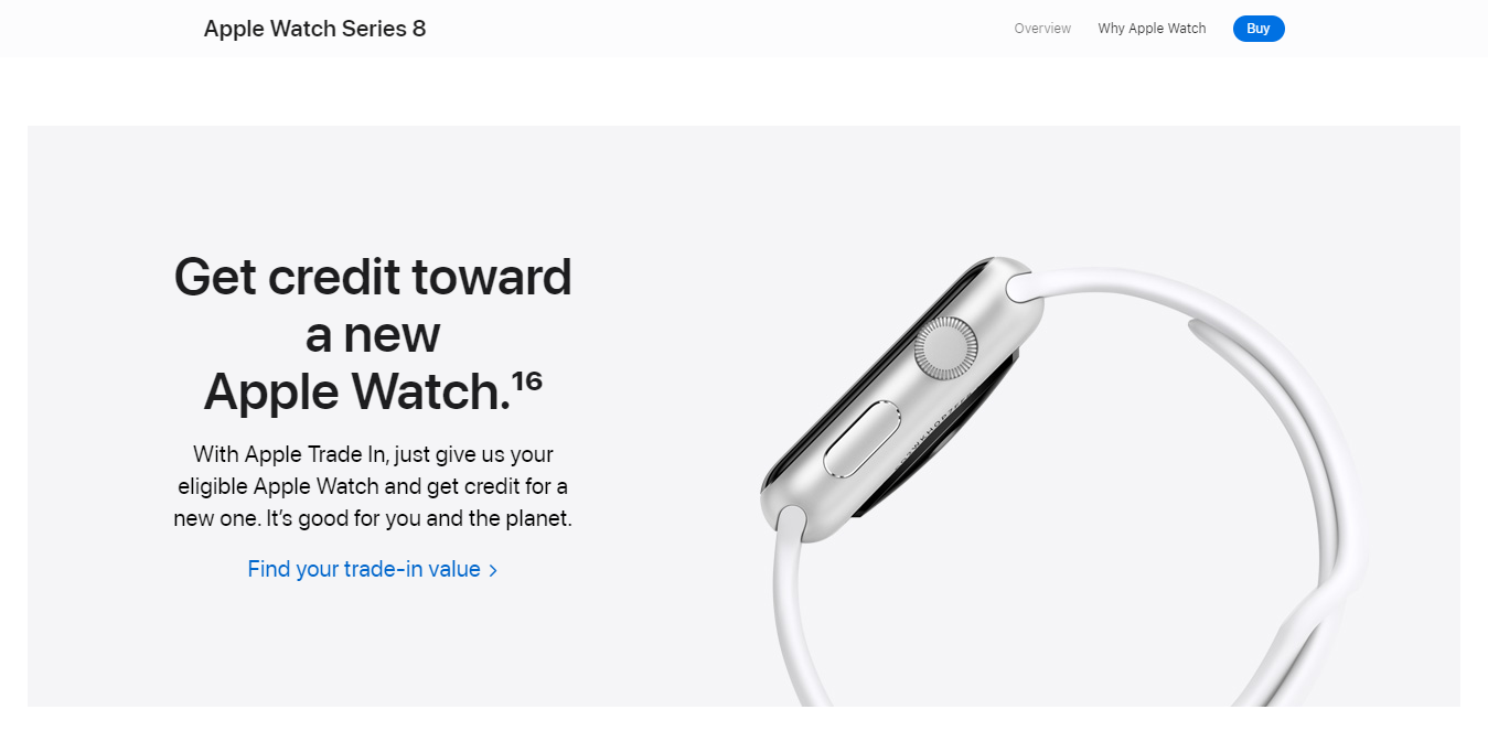
Apple’s watch series page shows the use of whitespace
2. Use of cool animations - Another important feature of Apple’s website design is the use of animated images. We can see in the screenshot below how Apple cleverly showcases its products using subtle yet effective techniques to capture attention. Likewise, users can interact with the animation by clicking on different parts of the screen. This allows users to explore the product in more detail, and it helps them to learn more about its features. This helps to create a positive emotion with the product.
Apple’s homepage with animated images.
Tools Employed By UX Designers
UX designers utilize a variety of tools to aid them in the design process and create exceptional user experiences. Listed are some commonly employed tools by UX designers:
1. Design and Prototyping Tools: Tools like Sketch, Adobe XD, Figma, and InVision enable UX designers to create high-fidelity mockups, wireframes, and interactive prototypes. They offer features for designing user interfaces, creating animations, and simulating user interactions, allowing designers to visualize and test their design concepts before implementation.
2. User Research Tools: User research tools help UX designers gather valuable insights into user behavior and preferences. Tools such as UserTesting, Optimal Workshop, and UserZoom enable designers to conduct remote usability testing, surveys, card sorting, and other research methods. These tools provide feedback, analytics, and user behavior data that inform design decisions.
3. Collaboration and Communication Tools: Collaboration and communication tools facilitate teamwork and streamline communication among UX designers, stakeholders, and developers. Tools like Slack, Microsoft Teams, and Asana enable designers to collaborate on projects, share design files, provide feedback, and manage tasks efficiently. These tools promote effective collaboration and project coordination.
4. Accessibility Testing Tools: Accessibility testing tools help UX designers ensure that their designs are inclusive and accessible to users with disabilities. Tools like WebAIM, WAVE, and AChecker evaluate web accessibility compliance, identify accessibility issues, and provide recommendations for improvement. These tools assist designers in creating products that adhere to accessibility standards and guidelines.
5. Usability Testing Tools: Usability testing tools aid UX designers in evaluating the usability and effectiveness of their designs. Tools like Maze, UserZoom, and Lookback facilitate remote user testing, screen recording, and user feedback collection. These tools help designers observe user interactions, gather qualitative and quantitative data, and refine the design based on user insights.
Information Architecture vs UX Design: What’s the Difference
It’s important to note that IA can exist separately from UX, however, UX cannot exist without IA. Let’s take a look at an overview of the overlapping and complementing areas of Information Architecture and UX Design.
| Factor | Information Architecture (IA) | UX Design |
|---|---|---|
| Focus | Content structuring and organization for easy finding | Emotions and psychology of the users. Overall user satisfaction and usability |
| Key Elements | Content hierarchy, navigation systems, taxonomy, search functionality | User research, interaction design, visual design, usability testing |
| Objectives | Optimize information findability and comprehension | Create enjoyable and intuitive user experiences |
| Key Activities | Organizing content, creating taxonomies, designing navigation systems | User research, wireframing, prototyping, usability testing |
| Deliverables | Site maps, content hierarchies, labeling systems, metadata, wireframes, prototypes | User personas, experience maps, empathy maps, journey maps |
| Scope | Primarily focuses on information structure and organization | Holistic approach encompassing aesthetics, interactions, and usability |
| Timeframe | Often established in the early stages of the design process | Spanning the entire design process, from research to implementation |
| Overlapping Areas | UX Design incorporates IA principles to create a seamless user experience | IA benefits from UX Design’s insights on user needs and interactions |
Final Thoughts
Information Architecture (IA) and User Experience Design (UX Design) are two essential disciplines that work hand in hand to create exceptional digital experiences. While IA focuses on organizing and structuring information to optimize findability and comprehension, UX Design takes a broader approach, considering overall user satisfaction and usability.
So, the next time you’re navigating a well-organized website or enjoying a user-friendly app, remember that Information Architecture and UX Design have worked hand in hand to create that delightful experience.
