September 6, 2023
Prototyping in UX design: A basic guide (benefits + types)


DURATION
10mincategories
Tags
share
What is Prototyping?
The average person spends 10 hours a day on their phone. That’s a lot of time to be using a product that’s not user-friendly. In a study by Nielsen Norman Group, 79% of users said they would abandon a website if it were difficult to use. So, how do you know if the product you’re building is one that people will enjoy using?
By prototyping.
Prototyping is creating early versions of your product to test and validate its usability and functionality before investing in development. By prototyping, you can identify and fix usability issues early on, get feedback from users, and communicate your ideas to stakeholders. This will help to build a product that users love and that is more likely to succeed.
What makes UX prototyping necessary?
Prototyping is the key to producing products that people enjoy. You could think your product is fantastic, but you won’t know until you put it to users. This makes the final product easier to use by allowing designers to test ideas and receive user feedback before development.
The following are some benefits associated with prototyping in UX design:
A. Improved User Experience
Understanding user behavior, needs, and trouble areas is made possible through prototyping. Designers may get customer input early on and make adjustments before the product is finished by building a functional prototype. By doing this, you can make that the product is user-friendly and satisfies the demands of the intended market.
A blog post from Nielsen Norman Group describes how Mozilla used prototyping to ease the experience of users when searching for help articles. During the prototyping session, Mozilla found that users had difficulty finding the help articles they were looking for. This feedback helped Mozilla to improve the search functionality on their website.
B. Enhanced Participation and Communication
Also, prototypes are a useful resource for inside teams. They aid in visualizing the designer’s concept and making it simple for stakeholders and engineers to grasp. This can assist to keep communication open and prevent misunderstandings.
They can be especially helpful for stakeholders who are not familiar with design or user experience. By creating a tangible representation of a product or feature, prototypes help everyone involved to see the big picture and understand how the different pieces fit together.
Additionally, prototypes let designers gather input from stakeholders and programmers at the beginning of the design process. The prototype may be modified in response to this feedback to fulfill the demands of all parties involved while also streamlining the development process.
C. Feedback and Validation at an Early Stage
“Prototypes are the best way to get feedback from users early and often,” says Jeff Gothelf, author of Lean UX. By collecting early customer input through prototyping, designers may save up to 90% on redesign expenses.
This is how prototyping achieves it.
Prototypes allow you to test your ideas with users early on. This is important because it gives you the opportunity to get feedback on your designs before you’ve invested too much time and money in development.
Prototypes can help you identify usability issues early on. This is important because it can save you a lot of time and money in the long run. If you can identify and fix usability issues early on, you’ll be less likely to have to make costly changes later on.
Prototypes can help you get buy-in from stakeholders. By showing stakeholders a prototype of your product, you can give them a better understanding of your vision and get their feedback early on. This can help to ensure that your product meets the needs of your stakeholders and that it is approved for development.
D. Savings in both money and time
A useful technique that can speed up development and save costs is prototyping. Early versions can save money later on by seeing and resolving functional problems beforehand on. Businesses can conserve a lot of time and money by doing this, which will speed up the time it takes for them to market their products.
In the same way, reducing the number of faults that need to be fixed before a product’s release helps to shorten time-to-market. This is so that you may test your product early on with people and obtain their input on how it functions. This input might assist you in identifying and correcting any usability issues before you release your product to the public.
E. Reduced Development Risks
Prototyping can help to identify technical issues early on. This is because prototypes can be used to test the functionality of a product before it is fully developed. This can help to identify any technical problems that may occur, such as compatibility issues or performance bottlenecks.
And by identifying and fixing technical problems early on, prototypes can help to ensure that the development process goes smoothly.
F. Collaboration
When kicking off a project, prototyping is an excellent method for teamwork and idea visualization. Teams can come up with creative concepts and brainstorm ideas by creating sketches and wireframes. This ensures that everyone is aligned and heading in the right direction.
Prototypes are also a valuable tool for gathering early feedback from stakeholders and generating insights through user testing.
An example of how prototypes are used in a user testing session is found here.
The Prototyping Process
The prototyping process is iterative, which means that you will likely go back and forth between the different steps as you get feedback from users. This is a normal part of the process, and it is important to be open to making changes to your prototype based on feedback.
It usually follows these steps:
Define the goals of the prototype. What do you want to test? What feedback are you hoping to get?
Choose the right type of prototype. There are many different types of prototypes, each with its own benefits and drawbacks. The best kind of prototype for a project will depend on the specific needs of the project.
Build the prototype. Several tools and methods can be used to do this.
With users, test the prototype through usability tests. Obtain user input and employ it to enhance the prototype.
Develop the prototype further. Based on the comments you get, modify the prototype.
Until you are satisfied with the prototype, repeat steps 4-5.
Types of Prototypes In UX Design
A large percentage of usability problems can be identified through low-fidelity prototyping. That’s why prototypes are a secret weapon of UX designers.
But the best type of prototype for you will depend on your specific project. Some questions to ask when choosing a prototype for a project are:
What are the specific goals of your prototype?
What are the constraints on your project, such as time and budget?
Who are your target users?
What kind of feedback are you looking for?
There are many different sorts of prototypes, each with advantages and disadvantages. Let’s look at them.
Low-Fidelity/Lo-fi Prototypes
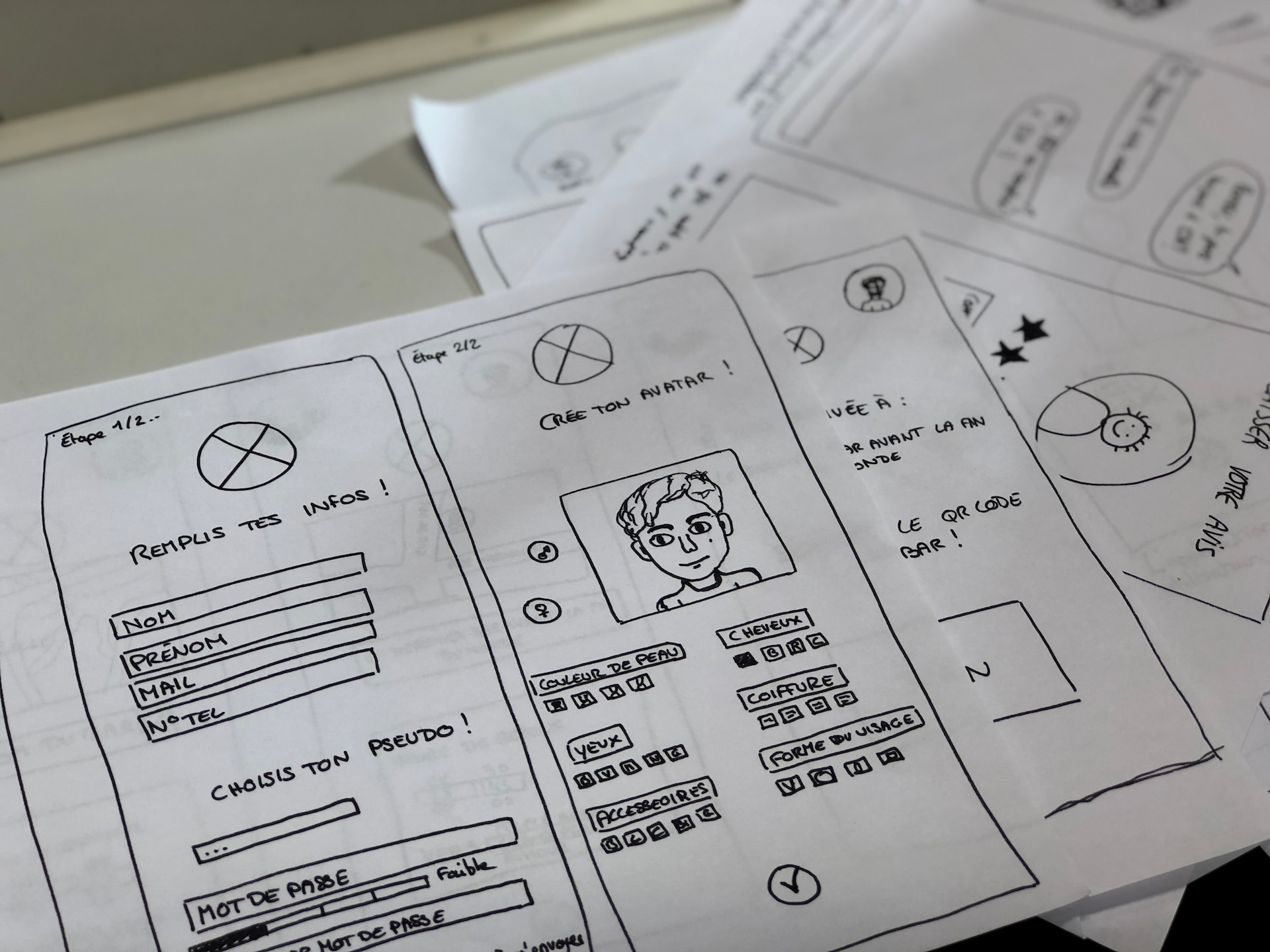
The most basic form of prototypes is low-fidelity ones. They are often made from paper, sticky notes, or other cheap materials. Lo-fi’s are ideal for testing and the early stages of design since they can be rapidly and readily created. Due to their lack of visual appeal, they might not be as effective for assessing complex interactions.
When are low-fi prototypes useful?
Low-fidelity prototypes are used in the early stages of the design process when designers continue to develop and test various ideas and concepts. They are used to:
Test the overall layout and structure of a product.
Get feedback on the flow of information.
Identify usability problems.
Validate assumptions about user behavior.
Some types of low-fidelity prototypes include:
Paper prototypes: These are made by sketching out the design of a product on paper. They can be used to represent the layout of a product, the flow of information, or the interaction between different elements. They are a good option for projects where it is important to be able to physically interact with the prototype.

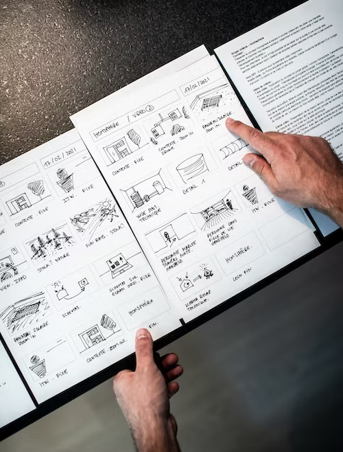
Storyboards: These are a type of low-fidelity prototype that uses images or text to represent the flow of a product. Storyboards can be used to show how users will interact with a product and to identify potential usability problems.

Pros
Quick and easy to create - This makes them ideal for early-stage design and testing. This can save time and money, and it allows designers to iterate on their designs quickly.
Inexpensive - They are made using low-cost materials, such as paper, sticky notes, or cardboard. This makes them a cost-effective way to test ideas and concepts.
Easy to get feedback - Low-fidelity prototypes are easy to share with others, which makes them a great way to get feedback from users.
Cons
Not visually appealing - Low-fidelity prototypes are not as visually appealing as high-fidelity prototypes. This can make it difficult to get feedback from users who are focused on the visual design of a product.
Not as effective for testing complex interactions - Low-fidelity prototypes may not be as effective for testing complex interactions. This is because they may not be able to accurately represent the way that a product will actually work.
Medium-Fidelity Prototypes/Mid-Fidelity Prototypes
Medium-fidelity prototypes strike a balance between low and high fidelity by providing enough visual detail to give users a good sense of the look and feel of the product, while also being interactive enough to allow users to test how the product works.
They offer more interactivity than low-fidelity prototypes because they typically include some interactive elements, such as buttons, text fields, and drop-down menus. They are typically created using digital tools, such as Axure, Adobe XD, or Figma.
When are medium-fidelity prototypes used?
They are used after low-fidelity prototypes have been created and tested. They can be employed to:
Get feedback on the visual design of a product.
Test the interactivity of a product.
Identify usability problems.
Validate assumptions about user behavior.
A type of medium-fidelity prototype is:
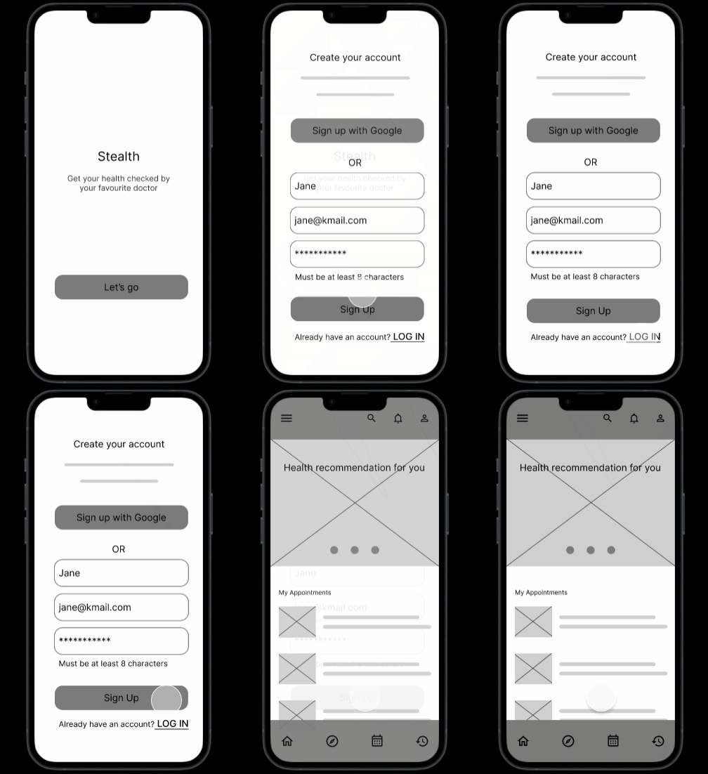
Wireframes and Clickable/interactive prototypes: Wireframes are a type of mid-fidelity prototype that focuses on the layout of a product. Wireframes typically do not include any visual elements, such as images or colors. They are used to represent the structure of a product and to test the flow of information. They are typically created with a wireframing tool like Axure. They can also be designed in Sketch or Figma usually in black and white, and then previewed in software like Invision or Marvel for prototyping.
In the same manner, wireframe prototypes that are clickable or interactive allow people to engage with the components of a product by clicking on them. Clickable wireframe prototypes can help discover possible usability issues by testing how consumers interact with a product. They may be leveraged to test intricate interactions and gather user input on the overall user experience.
The image below shows how an onboarding process in mid-fidelity could look.

Pros
More visually appealing - They are more visually appealing than low-fidelity prototypes, which can make them easier to get feedback from users.
More interactive - Medium-fidelity prototypes are more interactive than low-fidelity prototypes, which can give users a better sense of how the product will actually work.
A good balance of cost and time - Medium-fidelity prototypes are a good balance of cost and time, as they are not as expensive or time-consuming to create as high-fidelity prototypes.
Cons
Not as realistic as high-fidelity prototypes - Medium-fidelity prototypes are not as realistic as high-fidelity prototypes, which can make it difficult to test some complex interactions.
Not as easy to iterate on as low-fidelity prototypes - Medium-fidelity prototypes can be more difficult to iterate on than low-fidelity prototypes, as they require more time and effort to update.
May not be as effective for testing the final user experience - This is because they may not be able to accurately represent the way that a product will actually look and feel.
High-Fidelity Prototypes
High-fidelity prototypes are the most visually appealing and interactive type of prototype. They are typically created using digital tools, such as Adobe XD or Figma. High-fidelity prototypes can test complex interactions and provide a realistic preview of the final product.
When are high-fidelity prototypes typically used?
High-fidelity prototypes are used in the later stages of the design process after low-fidelity and medium-fidelity prototypes have been used to test the overall layout and structure of a product. They can be used to:
Get feedback on the final user experience
Get buy-in from stakeholders
Demonstrate the product to potential customers
A type of high-fidelity prototype is:
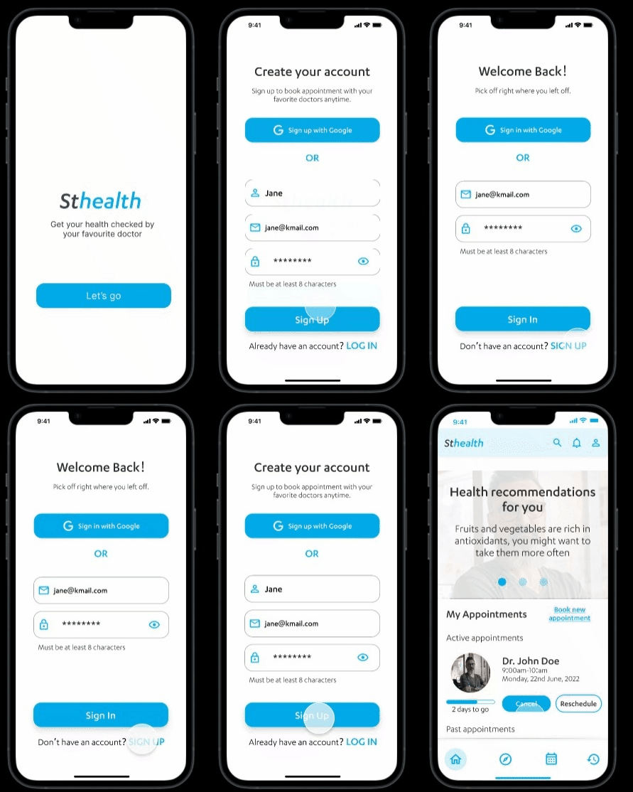
Clickable/Interactive prototypes: Prototypes that are clickable or interactive enable people to engage with the components of a product by clicking on them. Clickable prototypes can help discover possible usability issues by testing how consumers interact with a product. They may be used to test intricate interactions and gather opinions of users on the overall user experience.
Let’s examine the high-quality version of the above onboarding process.
Pros
High visual appeal - High-fidelity prototypes have attractive visuals, which can assist pique consumers’ interest in and engagement with the prototype. This is particularly useful for visual design-focused products like e-commerce websites and mobile applications.
Realistic interactivity - High-fidelity prototypes can be interactive, which allows users to interact with the prototype in a way that is similar to how they would interact with the final product. This can help to identify any usability problems that may occur in the final product.
Near-realistic user experience - High-fidelity prototypes can simulate a near-realistic user experience, which can help get users’ feedback on the product’s overall usability. This can be helpful for identifying any problems that users may have with the product, such as difficulty understanding how to use the product or frustration with the product’s performance.
Cons
Time-consuming and expensive to create - High-fidelity prototypes can be time-consuming and expensive to create, which can make them a less feasible option for projects with limited time or budget.
May not be as effective for testing early-stage ideas - High-fidelity prototypes may not be as effective for testing early-stage ideas, as they can be too polished and may not accurately represent the final product.
Prototypes for Virtual Reality (VR) and Augmented Reality (AR)
Users can engage with digital information more immersively thanks to the upcoming technologies of virtual reality (VR) and augmented reality (AR). When compared to AR, which superimposes digital material over the actual environment, VR delivers an entirely immersive experience.
VR and AR prototypes can be used to design and test immersive user experiences. They allow designers to see how users interact with digital content in a realistic environment and identify potential usability problems.
When are VR and AR prototypes used?
VR and AR prototypes are early versions of VR and AR experiences created to test the design and functionality of the experience. They can be used to:
Test the feasibility of a VR or AR experience.
Get feedback from users
Demonstrate the experience to stakeholders
Some examples are;
IKEA Kreativ - is an augmented reality software that enables customers to visualize how IKEA furniture will appear in their residences. Users may place digital furniture in their physical surroundings and view how it appears from various perspectives.
Google Tilt Brush - Users may paint in a 3D environment using the AR painting software Google Tilt Brush.
Note: These examples would better be appreciated if you download the IKEA Kreativ and Google Tilt Brush apps or try them out from their respective websites.
Benefits
Increased immersion - VR and AR prototypes can create a more immersive experience for users, which can help designers identify potential usability problems.
Reduced development costs - VR and AR prototypes can help to reduce development costs by identifying potential problems early in the design process.
Improved user feedback - VR and AR prototypes can help to improve user feedback by allowing users to interact with digital content in a more realistic environment.
Challenges
Cost - VR and AR prototypes can be expensive, especially if they are high-fidelity.
Hardware requirements - VR and AR prototypes require specialized hardware, such as VR headsets or AR glasses. This can make them difficult to use for testing with many users.
Software requirements - VR and AR prototypes require specialized software like Unity or Unreal Engine. This can make them difficult to create for designers unfamiliar with these platforms.
Final thoughts
Prototyping is the secret weapon of UX designers who want to take a step toward better UX. There are many different types of prototypes, each with its own benefits and drawbacks. But, the best type of prototype for a particular project will depend on its specific goals.
Whatever kind of prototype you decide on, iterative design is made possible via prototyping, which enables designers to test their concepts. For that reason, dear designers, make use of prototypes to fill the gap between ideas and realities.